Responsive Web Design: Creating Flexible Websites That Last
by Skillshare
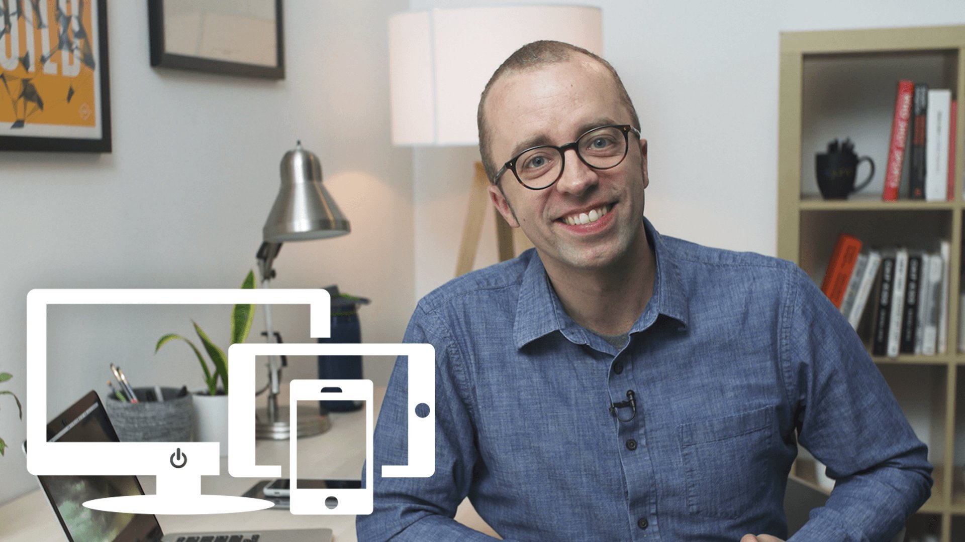
We’re all using more devices and screens than ever before. Join web designer Ethan Marcotte for the perfect, practical introduction to demystify Responsive Web Design.
As websites moved off of desktops and onto phones, tablets, and beyond, web designer Ethan Marcotte saw the need for a new approach to how we build and think about websites.
His solution? Responsive Web Design.
Ethan’s concept of responsive design paved a path for designers all over the world to design a single, flexible experience instead of individual builds for every new device.
This 60-minute class is a comprehensive, behind-the-scenes look into Ethan’s intuitive, timeless approach to responsive design.
Key lessons include:
- Building fluid grids as your website’s foundation
Similar Courses


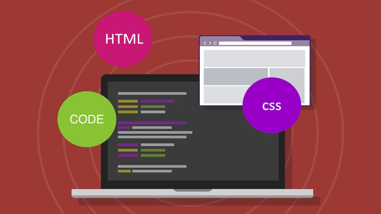
Beginner HTML & CSS: Build your own personal blog!
 Introductory

DIY Filming and Editing: How to Create Cinematic Beauty Videos
Introductory
Regain Your Time: Balancing Excellent Customer Service with a Healthy Schedule
Introductory

Inclusive UX: Designing Websites for Everyone
Introductory
Intro to SVG Laser Files for Surface Designers: Sell Digital Files on Etsy with Adobe Illustrator
Introductory
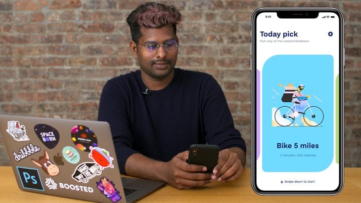
Mobile App Design: Simple Interactions & Animations for Every App
Introductory
Brand and Web Design: Create a Visual Language From Scratch
Introductory

Boost Your Online Brand: Make Creative Animated Banners in Adobe Photoshop
Introductory

Concept Testing: Testing Products Before Pushing to Market
Introductory