
TecdeMonterreyX: Visualización de Datos - Impacto en la Gestión Empresarial
by Tecnológico de Monterrey
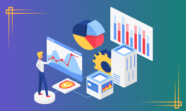
Visualización de datos - Impacto en la gestión empresarial
Course Description
Welcome to "Visualización de datos - Impacto en la gestión empresarial" (Data Visualization - Impact on Business Management), an essential course for anyone looking to harness the power of data in today's business landscape. In this comprehensive program, you'll dive into the world of data visualization, learning how to transform raw data into meaningful and visually compelling representations that drive decision-making and innovation.
This course focuses on three of the most preferred tools in organizations for extracting significant information from ever-increasing volumes of data: Tableau, Power BI, and Python. By mastering these tools, you'll be equipped to leverage data effectively, make informed decisions, and stay at the forefront of today's data-driven business environment.
What students will learn from the course
- Identify key elements in constructing data visualizations that facilitate decision-making for middle and upper management.
- Understand data taxonomy and interpretation to measure business impact and effectively communicate information to internal and external audiences.
- Distinguish essential elements for effective data visualization using Tableau, Power BI, and Python.
- Learn best practices in data visualization.
- Understand how data visualization enhances communication and collaboration within organizations.
- Develop skills to identify actionable insights and drive innovation through data visualization.
Prerequisites or skills necessary to complete the course
- Basic knowledge of programming and statistics
- Analytical skills for data interpretation
What the course will cover
- Best Practices in Data Visualization
- Data Visualization with Tableau
- Data Visualization with Power BI
- Data Visualization with Python
- Techniques for transforming raw data into meaningful visual representations
- Methods for identifying patterns, trends, and outliers in data
- Strategies for effective storytelling through data visualization
Who this course is for
This course is ideal for:
- Business professionals seeking to enhance their data analysis and presentation skills
- Managers and executives looking to make more informed, data-driven decisions
- Data analysts and scientists wanting to improve their visualization techniques
- Anyone interested in learning how to effectively communicate complex data through visual means
How learners can use these skills in the real world
- Improve decision-making processes within organizations by presenting data in easily understandable formats
- Enhance communication and collaboration across teams and departments
- Identify new business opportunities and trends through interactive data exploration
- Create compelling presentations and reports that effectively convey complex information
- Drive innovation and gain competitive advantage by uncovering hidden relationships in data
- Streamline operations and improve efficiency by visualizing key performance indicators
Syllabus
- Best Practices
- Data Visualization with Tableau
- Data Visualization with Power BI
- Data Visualization with Python


Avado: Principles of Analytics
 Intermediate
 5
weeks
5
weeks

DavidsonX: Analyzing and Visualizing Data with Power BI
Introductory
4
weeks

edX: Intro Course: Data Storytelling
Introductory
4
weeks

BoxPlay: Data Analytics: A Fast-Track Guide to Becoming Data-Led
Introductory

NUS: Data Science for Construction, Architecture and Engineering
Introductory
7
weeks

UCSanDiegoX: Python for Data Science
Advanced
10
weeks

IEUniversity: Introduction to Data Strategy, Management, and Governance
Introductory
6
weeks

ASUx: Business Intelligence and Data Analytics
Introductory
5
weeks

IBM: Data Analytics and Visualization Capstone Project
Introductory
6
weeks

RITx: Data Processing and Analysis with Excel
Intermediate
4
weeks